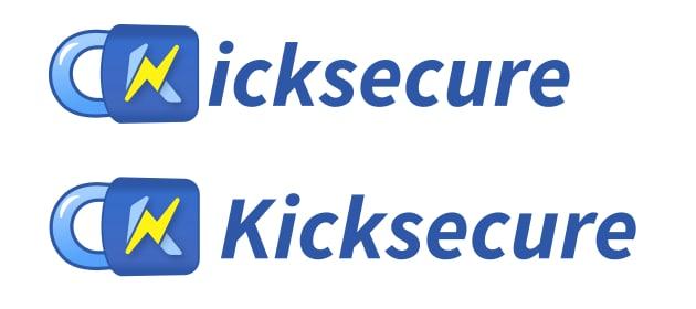
Hope I’m not too late to the party. In draft 1, the bottom-right logo looks like it says “Icksecure” due to the separation of the lock from the rest of the text; this is unfortunate given that “Ick” is associated with disgust in English. I’d suggest prepending the “K” letter there, similar to how the text in the bottom-left logo looks. This also applies to the similar-looking logos in draft 14, the top-right logo in draft 15, and the top logo in draft 18.
1 Like
Kinda late. The logo is already live in the Kicksecure wiki.
Do your comments apply to the already live version?
Of the wiki logos, my concern applies to the “Text Logo”, and its derivatives “Facebook banner”, “Facebook post”, “Twitter banner”, “Twitter post”, and “Twitter resized”. I would suggest inserting a “K” letter between the blue rounded square and “icksecure”, so that the word “Kicksecure” appears as it does in the “Basic Logo”. (I assume this edit is easy to make on a technical level, though I don’t know how inconvenient it is to update the logo everywhere that it’s been posted already. I do think it would be a substantive improvement.)
2 Likes
nice catch @JeremyRand. @Patrick May I suggest an alternative design where the branding sports the normal Kicksecure like picture B but i’s dot is replaced by a miniature lock in an upright position sporting the enhanced ‘K’? Jeremy’s suggestion is quicker to incorporate however.
1 Like
This was done.
1 Like
Using this forum thread to discuss related branding. For lack of better term, here is a “box design”.
https://www.kicksecure.com/wiki/File:Kicksecure-general.jpg

Thoughts?
That box design would be used in the future on kicksecure.com homepage.
That box design can be seen in action here:
1 Like
How the hell did nobody make a kicksecure mug yet. I know it is supposed to be a lock